Product Image Slider for Shopify Dawn Theme Using Web Components
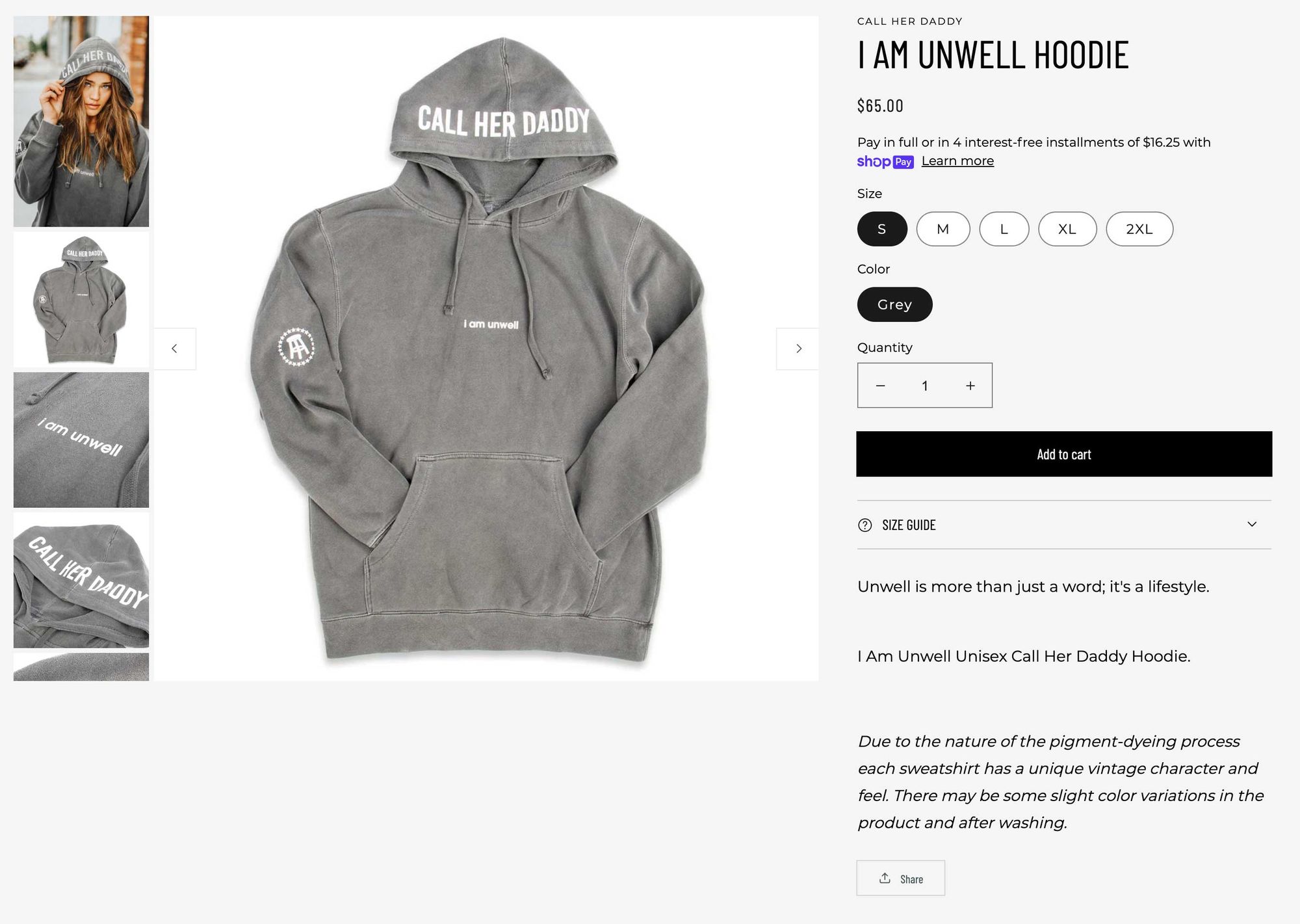
This blog will guide you through creating a more traditional product image gallery for the Dawn theme.

Among the multitude of updates announced at Shopify Unite 2021 was the introduction of a new starter theme built by Shopify called Dawn. The theme is a great resource for learning and using Shopify's Online Store 2.0 and it's new features.
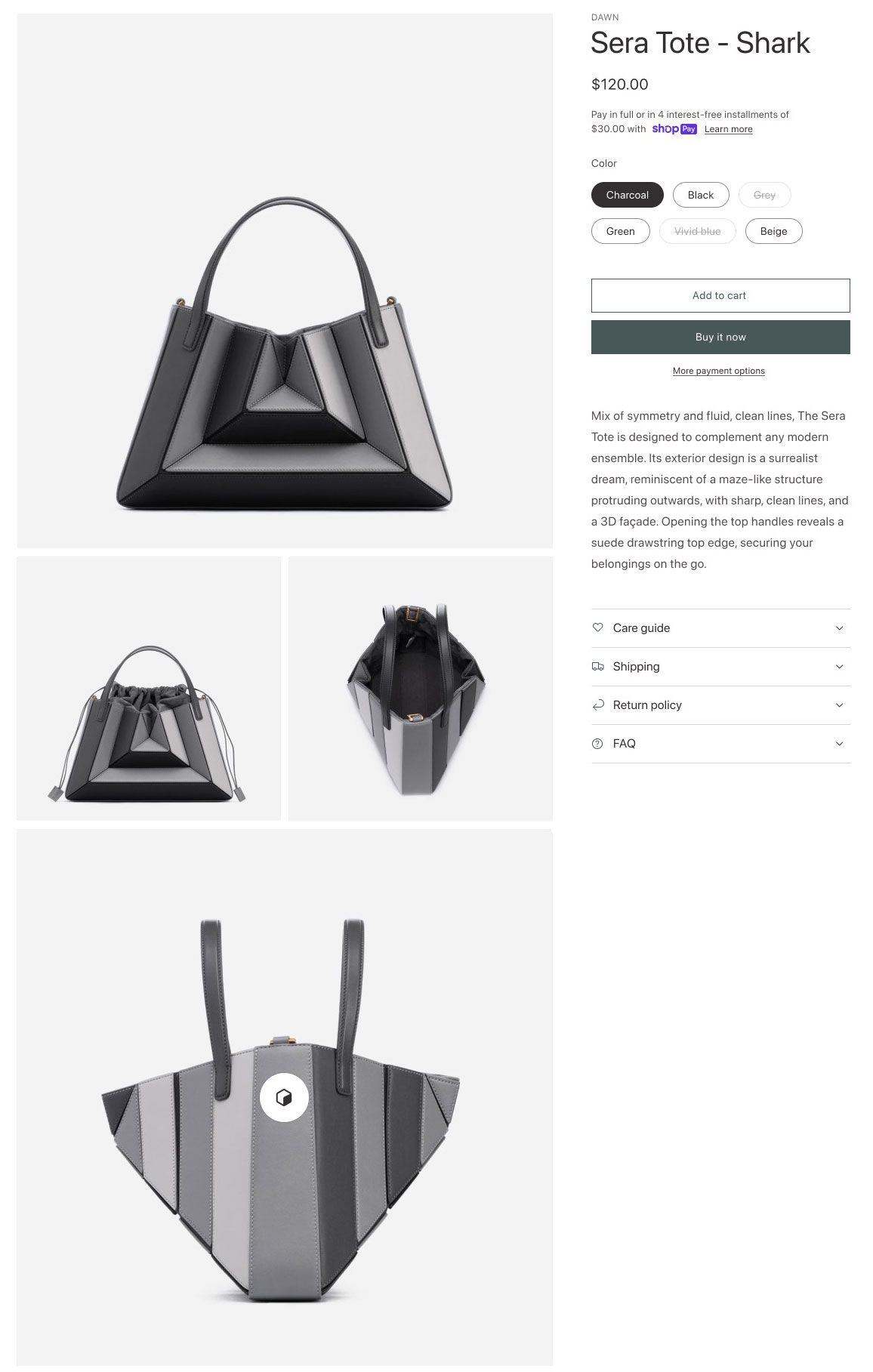
The team at Shopify put a lot of time and effort into the UX and you can read about their approach here. While I like a lot of the choices they made when designing the theme there is one component in particular that may not be best for all stores. On the product detail page product images are laid out in a grid rather than using a more common image slider gallery.

This blog will guide you through creating a more traditional product image gallery for the Dawn theme.

One thing you will notice when browsing the code for the Dawn theme is the decision to use Javascript sparingly and leverage broswer APIs for progressive enhancement. One of these APIs is the Web Components API to create custom elements. We will leverage Web Components to create our product image gallery.
Let's start by writing our liquid mockup for the image slider:
<product-gallery class="product-gallery">
  {%- if product.media.size > 1 -%}
  <ul class="product-gallery__nav">
    {%- for media in product.media -%}
      <li class="product-gallery__nav-item {% if media.id == product.selected_or_first_available_variant.featured_media.id %}product-gallery__nav-item--active{% endif %}" data-media-id="{{ media.id }}">
        {% render 'product-thumbnail', media: media %}
      </li>
    {%- endfor -%}
  </ul>
  {%- endif -%}
  <div class="product-gallery__images">
    {%- for media in product.media -%}
      <div class="product-gallery__image {% if media.id == product.selected_or_first_available_variant.featured_media.id or product.media.size == 1 %}product-gallery__image--active{% endif %}" data-media-id="{{ media.id }}">
        {% render 'product-thumbnail', media: media %}
      </div>
    {%- endfor -%}
    <button type="button" class="slider-button slider-button--prev" name="previous" aria-label="{{ 'accessibility.previous_slide' | t }}">{% render 'icon-caret' %}</button>
    <button type="button" class="slider-button slider-button--next" name="next" aria-label="{{ 'accessibility.next_slide' | t }}">{% render 'icon-caret' %}</button>
  </div>
</product-gallery>
First we set up our product-gallery custom element. If the product has multiple images we will render the thumbnail navigation element: ul.product-gallery__nav. We then create a div.product-gallery__images to hold the current image being displayed. By default these images will be hidden unless the item is the active image, which is designated with a classname .product-gallery__image--active. We also add navigational buttons for previous and next slide. The product-thumbnail snippet we use for our images is the one that comes with the theme with some minor changes to remove the modal that displays a larger image.
Next let's add some CSS:
.product-gallery {
  display: flex;
}
// Slider buttons are positioned absolutely over the active image
.product-gallery .slider-button {
  position: absolute;
  top: 50%;
  transform: translateY(-50%);
}
.product-gallery .slider-button:not([disabled]):hover {
  border-color: rgba(var(--color-foreground), 0.3);
}
.product-gallery .slider-button:disabled {
  display: none;
}
.product-gallery .slider-button--prev {
  left: 0;
  border-left-width: 0;
}
.product-gallery .slider-button--next {
  right: 0;
  border-right-width: 0;
}
// Thumbnail navigation will not exceed the height of the active image and will scroll overflowing elements
.product-gallery__nav {
  width: 140px;
  list-style: none;
  margin: 0 .5rem 0 0;
  padding: 0;
  height: 100%;
  overflow-y: auto;
  display: none;
}
.product-gallery__nav::-webkit-scrollbar {
  display: none;
}
.product-gallery__nav-item {
  display: block;
  cursor: pointer;
}
.product-gallery__nav-item + .product-gallery__nav-item {
  margin-top: .5rem;
}
.product-gallery__nav-item img {
  width: 100%;
  display: block;
}
.product-gallery__images {
  flex-grow: 1;
  height: fit-content;
  position: relative;
}
// Hide images unless they are the active image
.product-gallery__image {
  display: none;
}
.product-gallery__image--active {
  display: block;
}
@media screen and (min-width: 750px) {
  .product-gallery__nav {
    display: block;
  }
}
Here we are setting up the basic layout for our gallery. Things to note are that the .product-gallery__nav will fill 100% of the height of it's parent. The parent .product-gallery will have it's height set programattically to be the height of the active image. This allows the nav to not exceed the height of the image and scroll if it does. I think this is a better use of vertical space than the default image gallery, especially if you care about the viewability of recommendations, reviews or user generated content below the main product. One other note is that the thumbnail navigation is hidden on mobile. I don't think it adds anything to the mobile experience and adds more images for the user to download. Our navigational elements do a good job of letting the user know there are more images without cluttering the UI.
Finally we create our Web Component for the slider:
class ProductGallery extends HTMLElement {
  constructor() {
    super();
    this.init()

    // Add resize observer to update container height
    const resizeObserver = new ResizeObserver(entries => this.update());
    resizeObserver.observe(this);

    // Bind event listeners
    this.navItems.forEach(item => item.addEventListener('click', this.onNavItemClick.bind(this)))
    this.prevButton.addEventListener('click', this.onButtonClick.bind(this));
    this.nextButton.addEventListener('click', this.onButtonClick.bind(this));
    // Listen for variant selection change to make current variant image active
    window.addEventListener('message', this.onVariantChange.bind(this))
  }

  init() {
    // Set up our DOM element variables
    this.imagesContainer = this.querySelector('.product-gallery__images');
    this.navItems = this.querySelectorAll('.product-gallery__nav-item');
    this.images = this.querySelectorAll('.product-gallery__image');
    this.prevButton = this.querySelector('button[name="previous"]');
    this.nextButton = this.querySelector('button[name="next"]');
    // If there is no active images set the first image to active
    if (this.findCurrentIndex() === -1) {
      this.setCurrentImage(this.images[0])
    }
  }

  onVariantChange(event) {
    if (!event.data || event.data.type !== 'variant_changed') return
    const currentImage = Array.from(this.images).find(item => item.dataset.mediaId == event.data.variant.featured_media.id)
    if (currentImage) {
      this.setCurrentImage(currentImage)
    }
  }

  onNavItemClick(event) {
    const mediaId = event.target.closest('li').dataset.mediaId
    this.images.forEach(item => item.classList.remove('product-gallery__image--active'))
    this.setCurrentImage(Array.from(this.images).find(item => item.dataset.mediaId === mediaId))
  }

  update() {
    this.style.height = `${this.imagesContainer.offsetHeight}px`
    this.prevButton.removeAttribute('disabled')
    this.nextButton.removeAttribute('disabled')
    if (this.findCurrentIndex() === 0) this.prevButton.setAttribute('disabled', true)
    if (this.findCurrentIndex() === this.images.length - 1) this.nextButton.setAttribute('disabled', true)
  }

  setCurrentImage(elem) {
    this.images.forEach(item => item.classList.remove('product-gallery__image--active'))
    elem.classList.add('product-gallery__image--active')
    this.update()
  }

  findCurrentIndex() {
    return Array.from(this.images).findIndex(item => item.classList.contains('product-gallery__image--active'))
  }

  onButtonClick(event) {
    event.preventDefault();
    let index = this.findCurrentIndex()
    if (event.currentTarget.name === 'next') {
      index++
    } else {
      index--
    }
    this.setCurrentImage(this.images[index])
  }
}

customElements.define('product-gallery', ProductGallery);
This is the bulk of the functionality for our gallery. We create our web component by extending the HTMLElement class. In our constructor we set up variables for our DOM elements and bind event listeners to the component. We rely on the data attributes set in our liquid to reference which thumbnails belong to which images to help with the onNavItemClick method as well as our onVariantChange callback.
Another caveat is using Array.from(this.images). The images are stored in a variable using querySelectorAll. This function returns a NodeList which is array-like but not an array. Our component uses array methods to do some of the heavy lifting so it's important to create an array from the NodeList and not use the NodeList directly.
Emit an event when a variant selection is made:
We want to update our slider so when a variant is chosen the active image is that variant's image. To do this we will add some code to the VariantSelects class in assets/global.js.
onVariantChange() {
  this.updateOptions();
  this.updateMasterId();
  this.toggleAddButton(true, '', false);
  this.updatePickupAvailability();

  if (!this.currentVariant) {
    this.toggleAddButton(true, '', true);
    this.setUnavailable();
  } else {
    this.updateMedia();
    this.updateURL();
    this.updateVariantInput();
    this.renderProductInfo();
  }
  // When variant is changed post a message with the variant's data
  window.postMessage({
    type: 'variant_changed',
    variant: this.currentVariant
  }, '*')
}
Using Shopify's new Dawn theme is a great way to see how Shopify thinks about theme development in 2021. When making changes for your store you should follow the patterns and conventions they are using but that doesn't mean you can't add your own features. Hopefully this blog helps get you started on that path by showing how to use a product image slider over their product gallery grid on the Dawn theme.
We are hiring a full-time Shopify Engineer to join our team. If you have experience creating custom Shopify experiences like this one please apply.

