Creating a slider component in React

As a digital media company, Barstool Sports is home to a lot of podcasts. In an average week we publish 100+ episodes and while a majority of people listen to these on platforms like Apple Podcasts or Spotify, we'd like to bring those listeners to our site.
In an effort to do this, we updated the audio player component all our sites use to have a more modern look and feel.

At its core it's the standard audio element with a React UI built on top that uses Refs to control the audio file. Nothing new there. Something that's somewhat unique though is how we went about presenting the range input elements for progress and volume control.
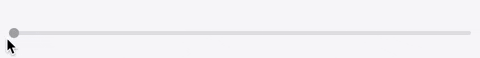
A good indication of progress or change needs a clear seperator for before and after, something that the default range input doesn't do too well. I've personally always had a strong disdain for the range input as I feel the element is unusable without throwing at least some css at it. Even then, trying to style it in a way with two colors has been something that has always stumped me. I was able to find a solution though that simply handles that problem. A solution so simple that I didn't believe it would work.
Before I get into that though let me quicky go over the logic behind the component.
Logic
The component, named Slider, takes mulitple props:
- colorAfter/colorBefore: the color of the bar before and after the current spot. The thumb of the slider will be the colorBefore.
- highlighted: the color of the thumb and the bar before it on hover
- size: height of the thumb (will grow
4pxon hover) - value: the current value. Will be between
0and1
also accepts additional props that will be directly passed to the input element
const Slider = ({
  colorAfter = '#E1E1E6',
  colorBefore = '#A5AAB2',
  highlighted = '#EB3E3E',
  size = 10,
  value,
  ...props
}) => {
  const percent = value * 100
  const growTo = size + 4

  const [hover, setHover] = useState(false)

  return (
    <StyledSlider
      type='range'
      onMouseOver={() => setHover(true)}
      onMouseLeave={() => setHover(false)}
      value={value}
      size={size}
      colorAfter={colorAfter}
      colorBefore={colorBefore}
      highlighted={highlighted}
      percent={percent}
      growTo={growTo}
      seeking={hover}
      {...props}
    />
  )
}
The input element here, StyledSlider, is actually a styled-components input element. This doesn't affect the element other than how the css is applied to it. A cool feature of styled-components though is that you can essentially pass props right to the css. As you'll see in the next section, most of the props for StyledSlider are solely to affect the look of the Slider.
Styling
Background: Initially we tried using styled-jsx to style the audio player but ran into issues upon testing integration into our sites. After digging through every issue in their repo and trying the provided solutions, we decided to switch to styled-components. It uses a very similar method as styled-jsx and was very easy to get the hang of.
The real magic of this component is in the styles because it seperates it from every other boring range input out there. This block of css might look a bit overwhelming, especially if you haven't used styled-components before, so let me highlight the key points and explain.
const transition = 'height 0.15s 0s ease, width 0.15s 0s ease'

const StyledSlider = styled.input`
  cursor: pointer;
  background: linear-gradient(
    to right,
    ${(props) => (props.seeking ? props.highlighted : props.colorBefore)} 0%,
    ${(props) => (props.seeking ? props.highlighted : props.colorBefore)}
      ${(props) => props.percent}%,
    ${(props) => props.colorAfter} ${(props) => props.percent}%,
    ${(props) => props.colorAfter} 100%
  );
  border-radius: 8px;
  height: 4px;
  width: 100%;
  outline: none;
  padding: 0;
  margin: 5px 10px;
  -webkit-transition: ${transition};
  -moz-transition: ${transition};
  -o-transition: ${transition};
  transition: ${transition};
  -webkit-appearance: none;
  &::-webkit-slider-thumb {
    border: none;
    -webkit-appearance: none;
    width: ${(props) => (props.seeking ? props.growTo : props.size)}px;
    height: ${(props) => (props.seeking ? props.growTo : props.size)}px;
    cursor: pointer;
    background: ${(props) => (props.seeking ? props.highlighted : props.colorBefore)};
    border-radius: 50%;
  }
  &::-ms-thumb {
    border: none;
    height: ${(props) => (props.seeking ? props.growTo : props.size)}px;
    width: ${(props) => (props.seeking ? props.growTo : props.size)}px;
    border-radius: 50%;
    background: ${(props) => (props.seeking ? props.highlighted : props.colorBefore)};
    cursor: pointer;
  }
  &::-moz-range-thumb {
    border: none;
    height: ${(props) => (props.seeking ? props.growTo : props.size)}px;
    width: ${(props) => (props.seeking ? props.growTo : props.size)}px;
    border-radius: 50%;
    background: ${(props) => (props.seeking ? props.highlighted : props.colorBefore)};
    cursor: pointer;
  }
`
The two color slider comes from using a linear-gradient background with the props for the value and different colors passed in. It may look a bit confusing with all the JS sprinkled in but it's really just telling it what colors you want to use and where to stop the before bar and thumb at.
background: linear-gradient(
    to right,
    ${(props) => (props.seeking ? props.highlighted : props.colorBefore)} 0%,
    ${(props) => (props.seeking ? props.highlighted : props.colorBefore)}
    ${(props) => props.percent}%,
    ${(props) => props.colorAfter} ${(props) => props.percent}%,
    ${(props) => props.colorAfter} 100%
);
The browser-specific styles target the slider thumb and basically do the same as mentioned above.
&::-webkit-slider-thumb {
    border: none;
    -webkit-appearance: none;
    width: ${(props) => (props.seeking ? props.growTo : props.size)}px;
    height: ${(props) => (props.seeking ? props.growTo : props.size)}px;
    cursor: pointer;
    background: ${(props) => (props.seeking ? props.highlighted : props.colorBefore)};
    border-radius: 50%;
}
&::-ms-thumb {
    border: none;
    height: ${(props) => (props.seeking ? props.growTo : props.size)}px;
    width: ${(props) => (props.seeking ? props.growTo : props.size)}px;
    border-radius: 50%;
    background: ${(props) => (props.seeking ? props.highlighted : props.colorBefore)};
    cursor: pointer;
}
&::-moz-range-thumb {
    border: none;
    height: ${(props) => (props.seeking ? props.growTo : props.size)}px;
    width: ${(props) => (props.seeking ? props.growTo : props.size)}px;
    border-radius: 50%;
    background: ${(props) => (props.seeking ? props.highlighted : props.colorBefore)};
    cursor: pointer;
}
Conclusion
While this focused on a method of creating a slider component that fit our needs at Barstool, hopefully this inspires you to improve upon any range input/sliders you may have on your site already. My main goal here was to present the ways of creating a two-color, unique slider as having separate colors and some animation really improves the usability of any element, but especially this one.